Two years ago, the Jets wore their reverse retro jerseys for the first time in February after they were revealed in November. When they were not worn by players the reaction seemed somewhat mixed but once worn on the ice they seemed to gain some traction. Fast forward to October of 2022 and the newest reverse retro uniform for Winnipeg was released which paid homage to the 90s Jets. This time around there was lots of love for this version although a consistent theme was fans desire for some red in the uniform.
It’s one thing however to see the images in a rendering. What about when actual Jets players are wearing these jerseys in a game? Yesterday afternoon we saw it for the first time in the 4-0 win by Winnipeg over Chicago.
Here are some photos of the jerseys being worn in the game shot by our incredible Illegal Curve photographer Colby Spence.
Up close and personal with the front crest on Connor Hellebuyck:
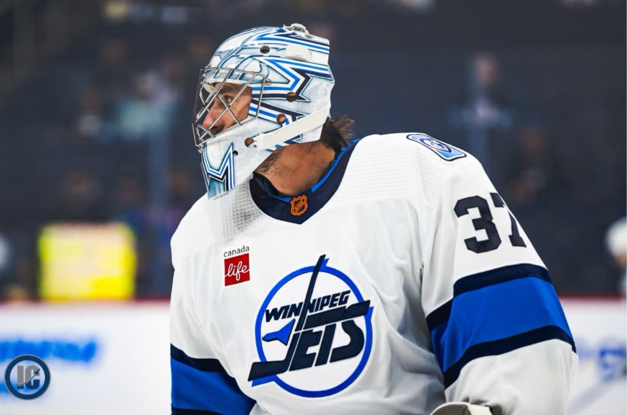
Photo Credit: Colby Spence (Illegal Curve)
Bending it like Axel Jonsson-Fjallby in warm-up:
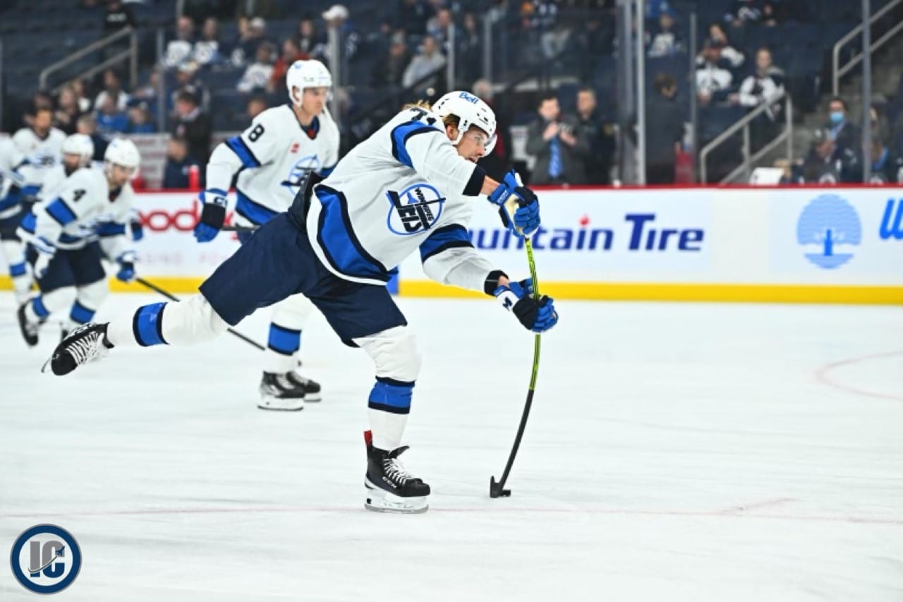
Photo Credit: Colby Spence (Illegal Curve)
Cole Perfetti about to set up a goal:
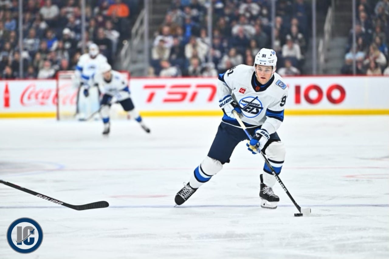
Photo Credit: Colby Spence (Illegal Curve)
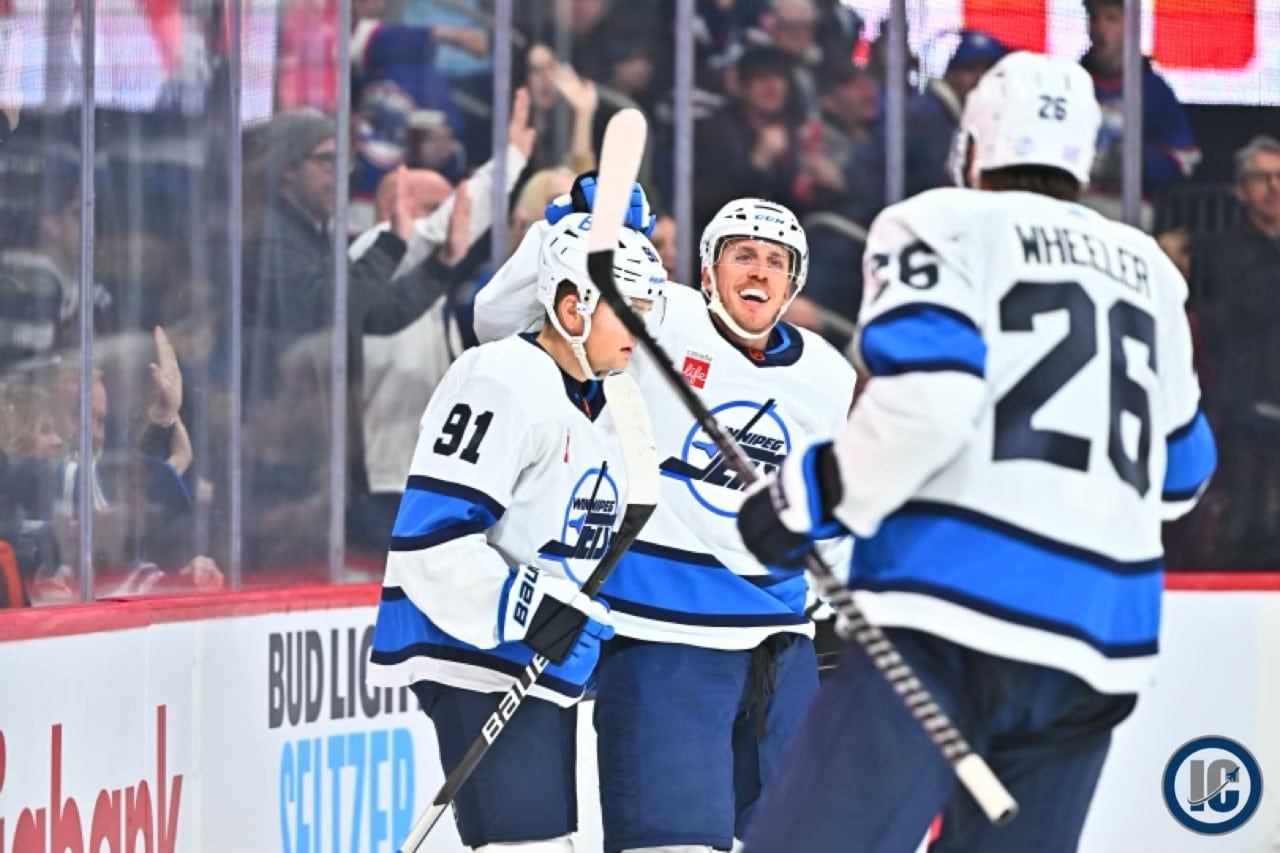
With Mambo No. 5 about to be played:
Now that you’ve had some time to reflect on the uniforms, see them on TV or via our photos, what say you? As always you are welcome to share your thoughts with us here or on our Twitter or Instagram accounts.
Here were some of the comments we’ve received to date:
Twitter:
– I like them, pretty clean and classic.
– i hate that shade of light blue. should try blue and gold.
– Awesome
– I would like them if they didn’t have that red patch
– They look great on TV
– I was pleasantly surprised. They look pretty good.
– They look good, except for that fugly distracting red advertising patch
– Still my favourite Winnipeg Jets logo.
– Looking good
– I love them! 10/10, would buy.
– Really liked them. I love the old school orange NHL logo on the collar and the rectangle shoulder patch is kind of a shout out to the Goals For Kids patch on the Jets 1.0 jersey
– I know a majority of us had opinions about a touch of red on these jerseys (and I share those opinions) but these jerseys are still pretty darn sharp.
– I like them a lot
– Really like the look
– At first I liked them, but now seeing them on tv during the game I love them! They look fantastic, big dub by the Jets on these
– I actually love them. They look much better on tv than the pics I have seen.
– These are playoff jerseys
– Wasn’t sure when they first were unveiled, but after seeing them worn in game action. Really really like them!
– Color scheme gives me the Sharks vibe, could use a hint of red.
– Still wish there was a bit of red somewhere but they do look great on the ice!
– Uniforms look great! Esp on tv
– Missing the red pants
– They’ve grown on me…I think I kind of like em now
– Love ‘em!!! …but I’m starting to wonder if it wouldn’t look better in red…
– Crest is sharp of course but the lighter blue is not helping.
– Oh and the sleeves are a major improvement on the white main jersey. Not a fan of the vertical long sleeve stripe at all.
– Got mine on order. I love them.
– Boring. It’ll be the only one I won’t buy. Just too plain. It’s ok at best.
– Absolutely not! They could have done much better.
– They look awesome on the ice.
– Wish they incorporated more of a 90s blue/teal or some red at least. Could have been way better. Still nice tho.
– Novel but a bit bland. Not a permanent fix. Heritage classic whites best in the league hands down.
– My husband quite likes them, he wants to add one to our Jets collection
– This might be my favourite jersey
– My favourite jersey EVER. So clean looking
– Agreed and I like them way better on than I when I first saw the pic
Instagram:
– Amazing
– Love the new Retro. Mine’s already out for shipping!
– Need more red! Other than they they’re sweet
– Really solid
– Cool
– I like them!
– This jersey is perfect for a whiteout, favourite jersey of all time already
– Love it
– Love them. This will always be my favourite Jets logo
– Good but needs red
– They look amazing
– Love it
– It’s ok
– They are good, however, they would be even better if they had some red in them (besides the eyesore of a sponsorship patch)
– Better than the aviator or the other reverse retro for sure
– I like it a lot, but needs a touch of rouge
– Looks frosty, I love it.
– Make them our road jerseys
– Best logo so far for Jets 2.0
– Looks killer as full uniform and yes red would be nice we get it people
– Insane
– they need white pants
– I’m planning on taking one home when they come out
– Love it
– Sharp looking jerseys!
– I really didn’t like it when they redesigned the logo in the 1.0 era. Now I can’t get enough of that design.
– I think they’re fine. Wasn’t a lot to the 90s jerseys, so these seem fine with me.
– Red would not match well here. I like them.
– Way better than the og one.
Now that you’ve had some time to reflect on the uniforms, see them on TV or via our photos, what say you? As always you are welcome to share your thoughts with us here or on our twitter and instagram accounts.