Lots of people don’t like change. As my old bus driver used to say “I knows what I likes and I likes what I know”. But sometimes folks can surprise you. Back in April of 2020 when the Jets had five jerseys to choose from (home/away, heritage classic 2016, heritage classic 2019 & the aviator) I asked fans which was their favourite and what caught me off guard was how much people loved the Aviator uniform.
After the reverse retro was revealed in November we asked folks for their reaction to the new look and there was a ton of opinion which as you might expect ran the gamut from love to hate.
It’s one thing however to see the images in a rendering. What about when actual Jets players are wearing these jerseys in a game? Last night we saw it for the first time in the 4-1 win by Winnipeg over Calgary.
Here are some photos of the jerseys being worn in the game shot by our incredible Illegal Curve photographer Colby Spence.
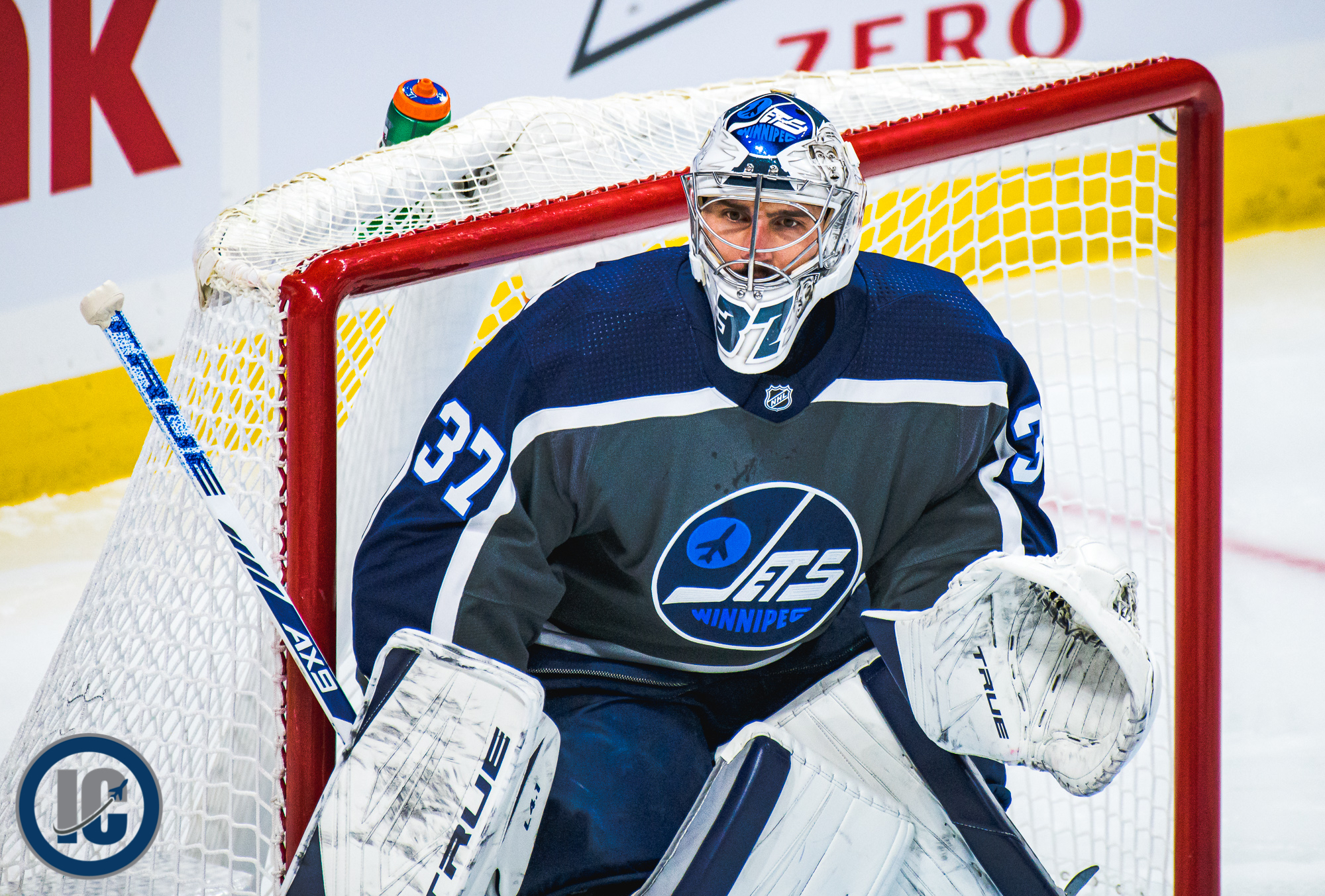
Photo Credit: Colby Spence (Illegal Curve)
And this one showing the back of the jerseys when Blake Wheeler and Kyle Connor were in a scrum:
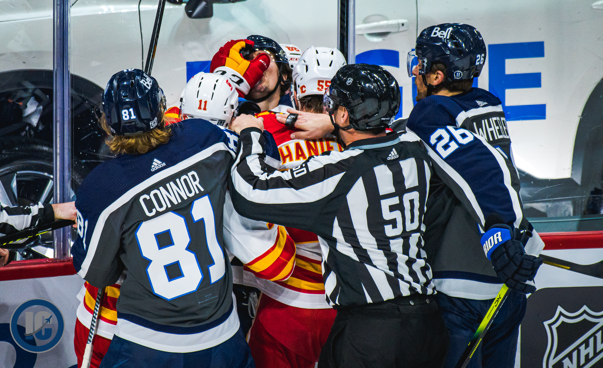
Photo Credit: Colby Spence (Illegal Curve)
Or a look at Mark Scheifele taking a faceoff which shows off the socks:
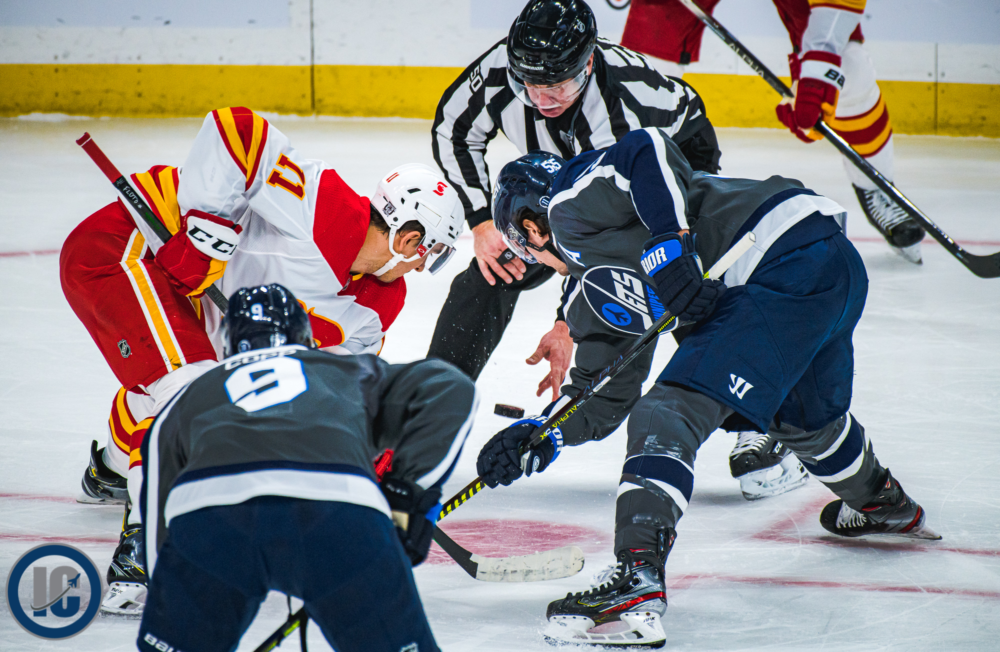
Photo Credit: Colby Spence (Illegal Curve)
Now on twitter and instagram we received many comments from folks on the jerseys during the game once they had been worn by the Jets. Here are some:
Via Twitter:
“These were absolute beauties. They need to wear them more often and I need to get my hands on one.”
“They’re ok practice or spongee team jerseys, but seem too meh for an NHL team.”
“I may not like the grey as much but the right blue logo is fabulous. Nothing compares to Heritage w/ red pants. Ranking: Heritage, 2.0, Retro and Walmart sales bin or year’s gone by, the Bay Basement, Aviator. Chipman got it right this time – Retro > Aviator”
“Saw them in person at the Jets store yesterday, much better in real life. Also look better on tv. Jumps ahead of the baby blue ones imo”
“Don’t get me wrong, I like the logo, but this is the 3rd time it’s been used on a Jets specialty jersey. At the very least I wish they went with a different logo. I understand why they ended up with this design, but still…”
“They don’t look as bad on the ice as I thought…”
“Did not like them when they came out… but they look badass on the ice.”
“Definitely an okay practice Jersey. A really ugly game Jersey”
“These are SICK.”
“Love these! Look awesome on the ice and with the numbers and name bars.”
“Love this uniform. Nice lines and colour combo.”
“I love these. Will buy one 100%”
“They’ve grown in me now. Replace the aviators with these”
“They look way better on the ice than in the promo images.”
“It looks way better in-game than it does on display.”
“Not a fan of them. I don’t understand the use of grey, never been a Jets jersey in the past with any grey in it that I am aware of. As noted by many looks like a practice jersey.”
“It looks like a practice jersey. This one is not going to grow on me like the aviator did”
“I’m telling you, I think they’re brilliant!”
Via Instagram:
“Looks pretty darn good!”
“Terrible launch, but surprisingly good in a game.”
“Grew on me. They look awesome”
“I wasn’t impressed originally but once I saw them on the ice I changed my mind. I thought they looked sharp”
“Didn’t like them at first but they’re growing on me.”
“Love them!!!”
“These jerseys look great on the ice. Too bad we only see them twice this year.”
Now that you’ve had some time to reflect on the uniforms, see them on TV or via our photos, what say you? As always you are welcome to share your thoughts with us here or on our Twitter or Instagram accounts.