On Monday morning the Winnipeg Jets Adidas Reverse Retro uniform was revealed. As you might expect there has been plenty of reaction to the uniform that will be worn by the local NHL squad next season.
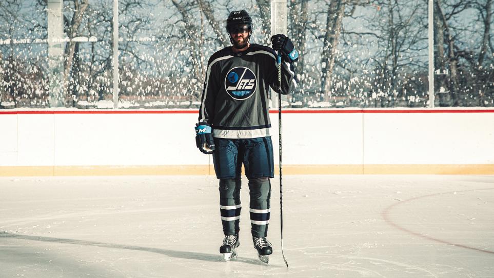
Photo Credit: Winnipeg Jets
I think Andrew ‘Hustlerama’ Paterson of TSN 1290 put it best after the reveal when he tweeted “Thankfully adidas revealed the reverse retros today. For those perpetually mad online, the jerseys provided a nice boost on a Monday morning like a strong cup of coffee. Ease in to the week complaining about a jersey before moving on to Covid, the gov’t, Trump and the other hits.”. The truth is if you hate or love the retro uniform it is entirely subjective as it is based on your taste. Nobody should be telling you to like something if you dislike it or vice versa.
About eight months ago I asked fans to select their favourite Jets jerseys (to date) and while the overwhelming favourites were the 2016 and 2019 Heritage Classics what surprised me was the number of folks who loved the Aviator uniforms, which isn’t one that seems to gets much positive attention.
Via Twitter:
@perch35km – They aren’t too bad. My money is going towards a Whalers/Canes jersey though. That’s the winner in the group imo
@karl_loepp – we’ve had the benefit of beautiful NHLJets jerseys from our rich hockey history. This incarnation is subpar…didn’t care for the Aviator either.
@Shawnass15 – Needs some red. Very underwhelming.
@bowtiejoe – A bit of a shame the main colour is GRAY. Couldn’t it have been RED?! Or navy with red accents? Anyway, the colours are meaningful and the past and present are incorporated.
@lewis_oman – 80s logo is overplayed. Wish we could work out a deal to get the 90s logo it’s so much better.
@McivorSj – It’s the grey that irks me.
@jkeezer77 – Barf on the grey But like old logo
@salvo_c – Blech!
@mark51978393 – I’m generally open minded but I truly hate it!! Where does grey come from am I missing something?
@shaku_bert – burn every single one of those monstrosities
@InDaIndica – Truthfully… I don’t hate it! The color scheme, while muted, is rare in the league so no lookalikes. I think the full uniforms will look sharp on the ice.
@DogOf_God – At least they went for it. A lot of other teams just mailed it in.
@SeanAndert – Not the worst, far from the best.
@DJFINS – I really like them….the Heritage Jerseys are some of the nicest jerseys ever….this isn’t supposed to be that, it’s different less traditional like they are supposed to be
@Bluemeanie7620 – Nice practice jersey.
@katheswain – Don’t like it at all. Very grey and drab. No red. How is this our retro.
@Vicster70300611 – I dig it.
@WPGJetsFan61 – Overall retro=money grab. And ugly is what many of them in the NHL and NFL are.
@BensCharlie – The grain needed to be switched out for a more poppy color in my opinion but I mean it’s okay
@Gojetsgo8 – They’re growing on me
@randallevee – Try again.
@kevinwpg – Those are nice pajamas now where’s the real one? Do we really need another Jersey with that
nhljets 1.0 logo why can’t we get one with the 1990s logo?
@GregP26 – Reminds me of a dirty Winnipeg snowbank on a busy street.
@PunditHawk – I dig em…
@Timfrantastic – I like it
@ArthurBignell – Like I tweeted to Hus, it will look fantastic when I put HAWERCHUK on the back!
@KenBrosowsky – I’m still split on if I like these yet. At first I hated them and now I’m back and forth. No wow , but wonder if they’ll grow on me.
@WpgHockTalk – after not having an NHL team for 15 years, any jersey that says Winnipeg or Jets is a thing of beauty to me.
Via Instagram:
ryfeakes1 – Think a thrashers throwback would have been better seeing as Colorado and Carolina went with the teams they were before being relocated.
kenbrosowsky – Yikes!! Not good.
keithrodney – Worst of all the Jerseys. Wasted opportunity to finally get a 90s throwback. Now we’ve got a dud – they already made 2 80s gems in the last 4 years lol.
dsarahs -So terrible!!
speckybeardo – It’s different, I’m into it. Glad they took the brief to heart instead of teams like the Islanders pulling a complete copout
brentlelond_photography – Love the pattern/layout….. hate the grey
art.of.the.perfection – love it!!!
harley_house – Reverse Retro. I see RETRO logo. What colour is slush GREY the REVERSE OF? THUMBS DOWN is also reverse.
marniemccutcheon – I like it
hannon306 – not overly impressed but the aviator blues grew on me so maybe these will to!
wpghockeydad – Yuck. Needs some red at least.
crys.lyn – sooooooo niiiiice 🙂
bjoleschuk – It’s clean but some red pinstripes or in strategic areas would go a long way
333cal333 – I think they could have done it differently. Instead of the grey being dominant, I’d do a red or light blue. But it’s not horrid. Just think this could have been better.
ryankirk92 – Ugly but definitely not the worst
bratsdigger – They look great!
carter.richardd – I love it
mikeromes19 – Ugly. We never had grey so ….
garretdu – So Heritage jersey but in grey. Reminds me of the Simpsons episode it’s the same Malibu Stacey doll, but with a hat!!
ajleis39 – Hope they look better on the ice like the aviator jerseys…not to sure about all of that grey tho….
guentherlandon – Awesome
tkruk1973 – It’s lacking red
dieguitowpg – A disaster..
neilr22 – Not a fan…. too plain, needs more colour.
chris_toph_009 – Clearance section incoming.
Some are even spending time editing and changing the jersey with different colour schemes including blue and red instead of the grey as can be seen in these photos by NRG21 Design:
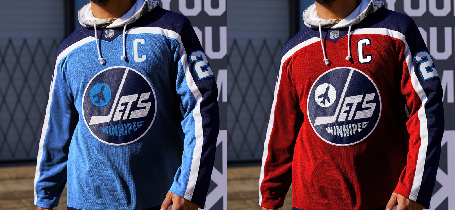
Photo Credit: NRG 21 Design
Or this one by KevinHurrieDesigns using red and the 90s logo:
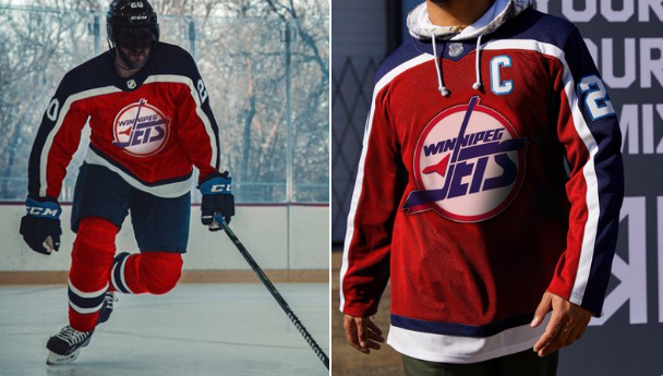
Photo Credit: KevinHurrieDesigns
Where do you stand when it comes to the newest Jets uniform? Feel free to share your thoughts on our Instagram or Twitter.