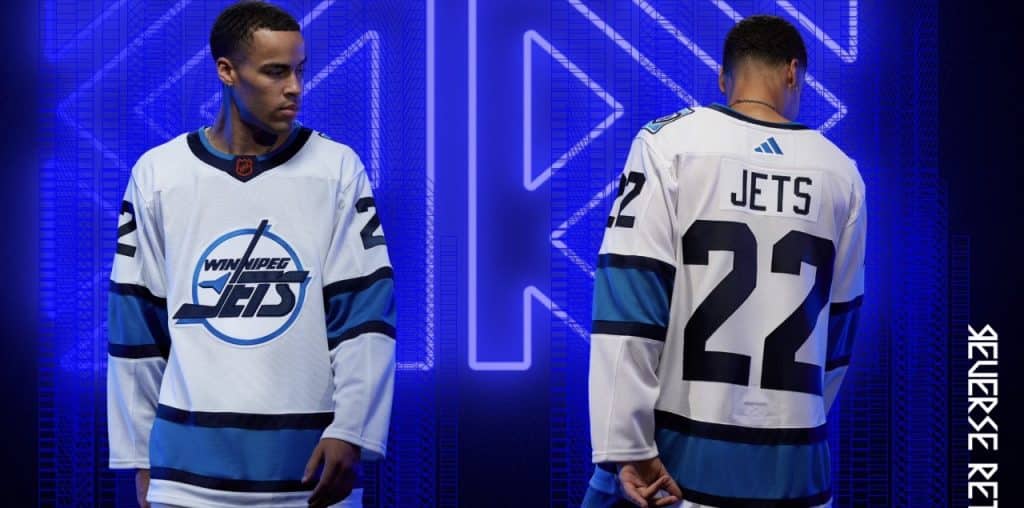
On Thursday morning the Winnipeg Jets Adidas Reverse Retro uniform was revealed. As you might expect there has already been plenty of reaction to the uniform that will be worn by the local NHL squad seven times this season.
The team released the seven dates they will wear them this morning:
November 5th vs Chicago
November 17th vs Anaheim
November 21st vs Carolina
December 8th vs St. Louis
December 9th vs Chicago
December 27th vs Minnesota
December 31st vs Edmonton
Here was fan reaction to us on Twitter and Instagram:
Via Twitter:
“Luv the logo.”
“I’m a fan.”
“Like the logo. But not a fan of the overall look of the jersey.”
“No Sir, don’t like it.”
“I’m not a fan of white jerseys most of the time but these I like.”
“So so so bland. There were so many options they could have used”
“Cold. Lifeless. Something a hockey zombie would wear. Perfect timing for Halloween.”
“Love’m”
“Not bad, not great. Like most of the reverse retro jerseys.”
“Other then the mustard stain that is almost certain to happen eating a jets dog, I don’t have a problem with them at all. Will pre-order a couple.”
“Kind of bland, tbh.”
“Beauties”
“Booooooooo”
“My honest opinion is that my wife is going to be pissed that I bought another jets jersey…. again!”
“I mean, I’ll buy one. But I probably shouldn’t.”
“I like it”
“I like it better than the pale blue version.”
“Perfect. A fresh take on a classic design, I’m not sure what people were expecting. Can’t wait to get one for the next whiteout (whenever that is).”
“As boring as can be. Plus it’s an away jersey. I like the logo’s colouring but that’s it.”
“Predictable and the easy option”
“Boring”
“These look way nicer than the previous retro reverse imo”
“The Jets have gone hard on the 70s nostalgia, and not without good reason. But it’s still nice to see the 90s get some love too.”
“My take is the reason most like them is the target demographic that grew up in the 90’s. Their first exposure before they left our fair town. I would’ve loved to see a 50th Anniversary WHA one though.”
“These are a step up from the aviator, IMO. In the video the quality of the jersey looks pretty bad. These look tissue thin.”
“Looks like a practice jersey. Love the 90s logo being back though”
There seemed to be quite a few folks that wanted some red in the jersey:
“I miss the red tbh. It’s decent don’t get me wrong but I get more ‘we avoided using red’ VS ‘we really wanted aviator blue’”
“Impressive, I’d would love to win a free one from IC”
“Like even if the stripes are red I think that would help. But I think it still looks really nice.”
“A little red in the logo would have taken in from an 8.5 to a 9.5.”
“Imagine just the red jet. That would be money.”
“I’m definitely missing the Red on the jersey.”
“Looks nice. Not sure why the jets seem to hate doing red in these rr takes”
“Meh, these are too similar to the greys to really be different. Why don’t they like red?”
“Honestly, I think taking the red out of either Jets jersey just sucks the life out of it. Feels so bland.”
Via Instagram:
“Clean”
“I know my next purchase, these are soooo slick, perfect for a whiteout”
“Love it”
“I think I’m into it”
“Boring”
“I like it a lot. That logo looks 3D with the way the aviator blue accents the 90’s logo (which has always been my fave).”
“Sharp”
“Better than the aviator”
“Just the aviators inverse colours with the old jets logo, wish they did something creative like some of the other teams got”
“ooof I need that”
“I love everything about this but the shoulder patch is what’s making me buy it”
“Absolutely money”
“I like it. 90s finally!”
“Meh”
“So sick bro. Their best jersey by far”
“Really wish they would have stayed away from the avaiator blue, otherwise I like them”
“I’m a fan”
“Don’t like it”
“Love it”
“Meh”
“Have been waiting for this one for years!”
“Adding to cart…”
“Finally they use that logo”
“it aight”
“It’s reverse AND it’s retro. Win/win.”
“Clean look”
“I really like it”
“Yes! Finally!!”
“They’re nice. Definitely better than the last reverse retros”
“Love it! It’s the logo I grew up with.”
Similar to twitter, there seemed to be a few folks that wanted some red in the jersey:
“Hmmm not bad. Wish there was SOME subtle Red”.
“Our 90s jerseys had some red in it, would have been nice to see a splash of red accent in these jerseys”
“Ugly!! Where is the Red??”
“Better than last one but wish there was red in it”
“Needs more red”
Where do you stand when it comes to the newest Jets uniform? Feel free to share your thoughts on our Instagram or Twitter.
We will re-visit this topic once the players wear them in a game (November 5th) because that seemed to change some folks minds back in 2020 with the first reverse retro uniform.